Colour
Brand Colour/Primary Colour
.colorCanJetRed
#ED1C24
Secondary Colours
.colorOrange
#EC9A29
.colorSteelBlue
#477CB2
.colorMaroon
#821214
.colorSapphire
#106184
.colorGoldenBrown
#A76A23
Feedback Colours
.colorPalePink
#FBDADC
.colorBeauBlue
#D5E8FC
.colorCultured
#F2F2F4
Functional Colours
.colorBlack
#000000
.colorgrey
#707070
.colorWhite
#FFFFFF
Neutral Colours
.colorBlack
#000000
.colorGrey
#707070
.colorWhite
#FFFFFF
.colorCultured
#F2F2F4
Page Layout
Our Grid-containers do not have round borders, possible to add up to 8 boxes
and only 2px delimiter border to be able to define objects.
Size 1 of 1
Size 1 of 2
Size 1 of 3
Size 1 of 4
Size 1 of 8
        <div class="container text-center">
          <div class="row">
            <div class="col-6">
              Column
            </div>
            <div class="col-6">
              Column
            </div>
          </div>
        </div>
Grid Mixing
Grid-containers can be mixed in combination of different sizes.
Responsive Solution
We have a breakpoint at 768px, for better browsing experience of our users.
When screen width is smaller than 768px, the following CSS code will apply:
         @media (max-width: 768px){
              .navbar-light .navbar-brand{
                    font-size:1.5rem;
                    }

              #sidebar {
                    width: 100%;
                    margin-left: 0;
                    position: absolute;
                    }

              #sidebar.active {
                    margin-left: -100%;
                    max-width: 100%;
                    width: 100%;
                    }
               }
Typography
Typeface
This is Dancing Script.
Our typeface.
Type Scale
Heading One |
60px | Dancing Script | .textHeading1 |
|---|---|---|---|
Heading Two |
40px | Barlow Condensed - Regular | .textHeading2 |
| Body | 20px | Barlow Condensed - Regular | .textBody |
| Body Bold | 20px | Barlow Condensed - Bold | .textBodyBold |
| Charts | 20px | Markazi Text - Regular | .textChart |
| Menu | 40px | Dancing Script | .textMenu |
Paragraphs
The default body text is 20px. For optimum reading length the paragraph width is capped at 800px.
Symbols
@ { & * " #
1. When we need to include trademark or other symbols into copy,
include the symbol without the <sup> tag.
2. When selecting a symbol as part of your design, make sure the
element enhances the idea and is in harmony with copy within the
asset.
For example:
- Use the number symbol to talk about a new campaign and/or promore a
hashtag.
- Use the forward slash symbol when talking about a new webpage or a
link.
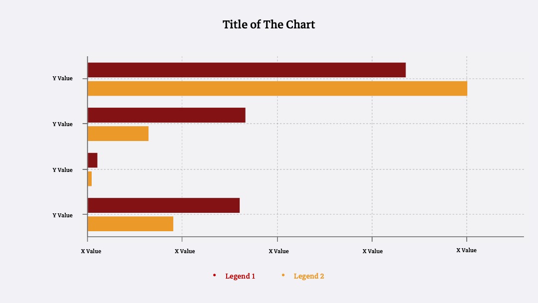
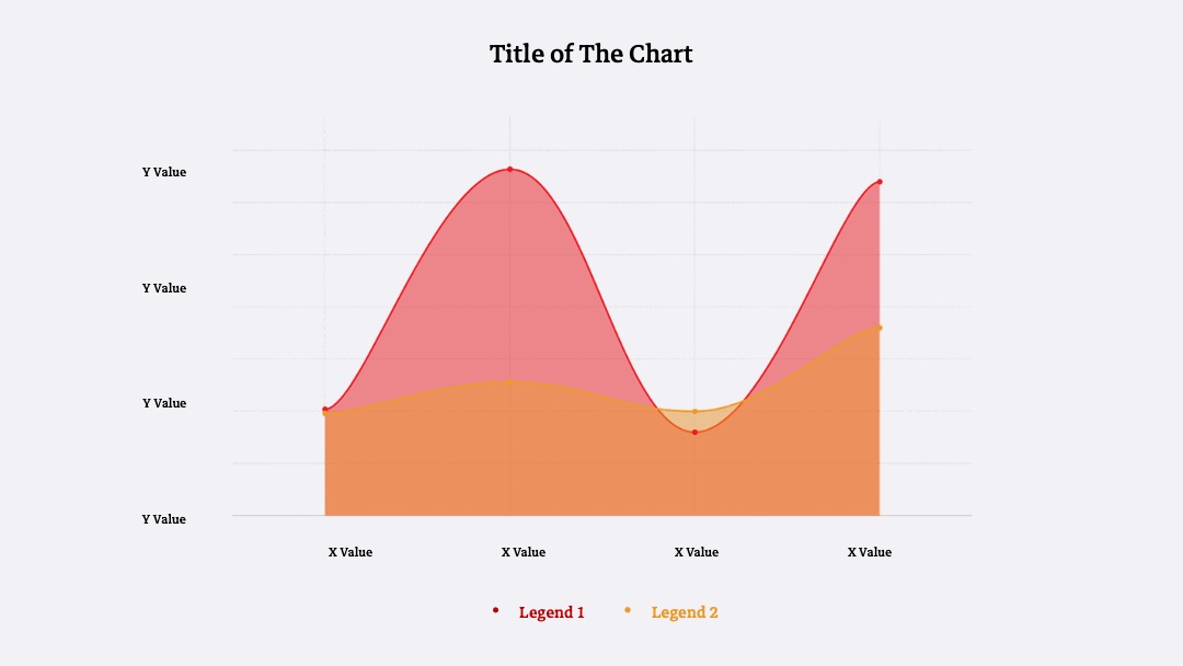
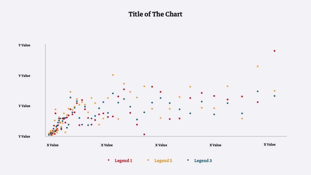
Data Visualization
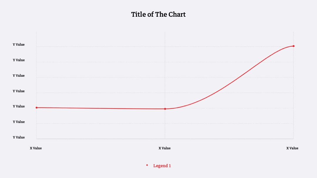
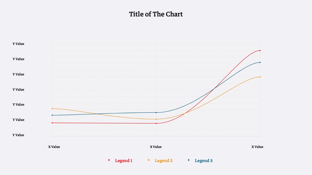
Line Graphs
Normal
Stacked
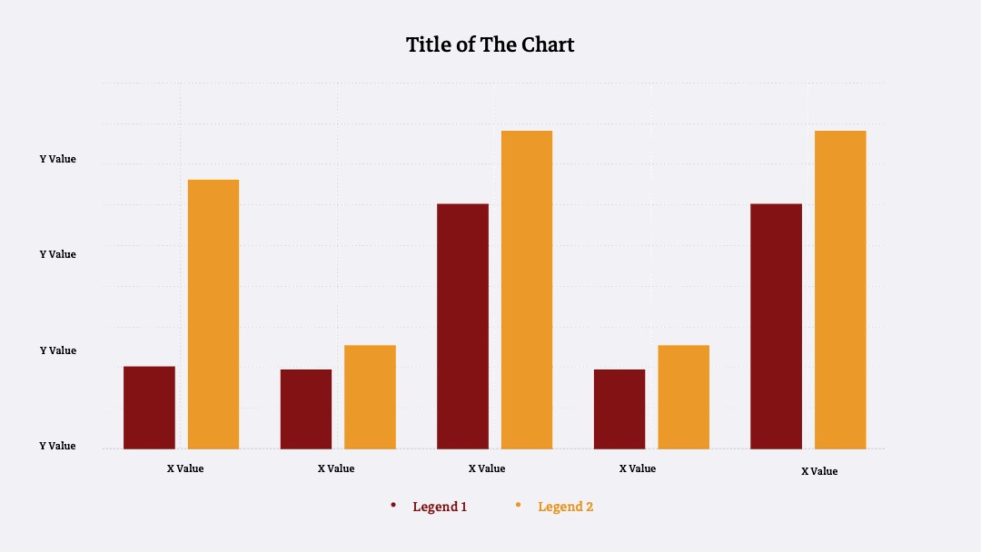
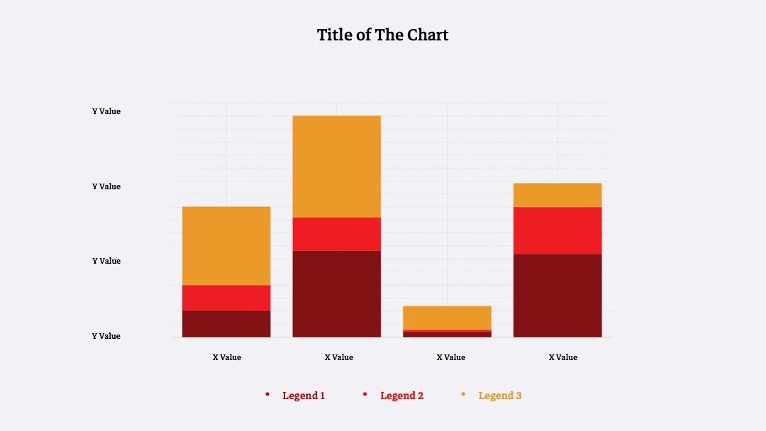
Bar Graphs
Normal
Stacked
Horizontal
Area Charts
Normal
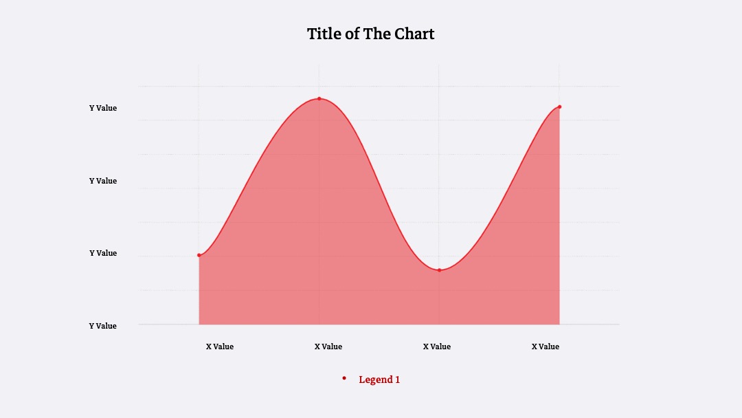
Stacked
Scatter Plot
Normal
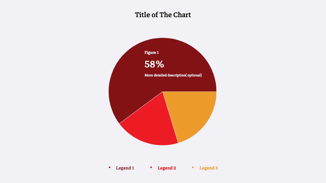
Pie Chart
Normal
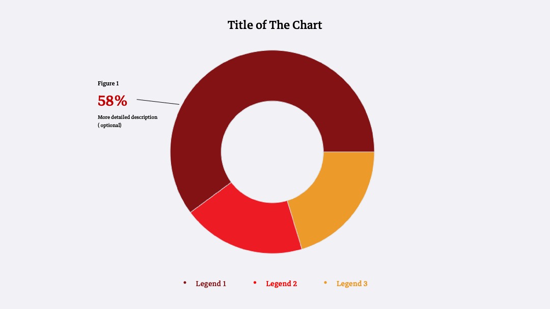
Donut Chart
Normal
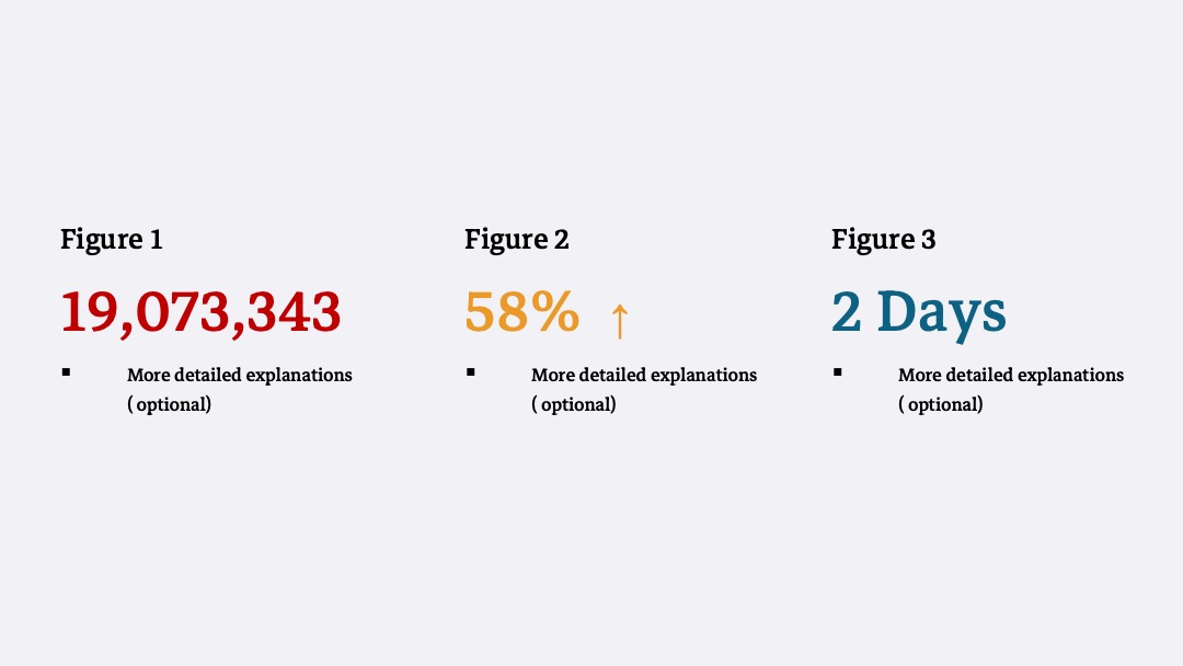
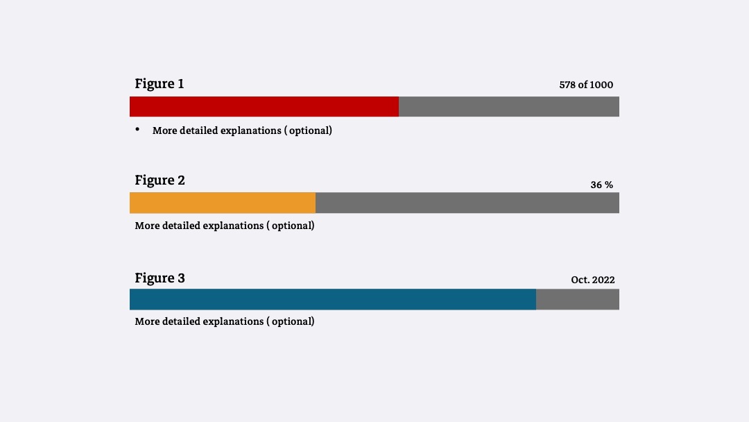
Single Value Charts
Numbers
Progress
Navigation
Basic Menu
This is a basic menu layout.
    <ul class="nav">
        <li class="nav-item">
            <a class="nav-link" aria-current="page" href="#">Home</a>
        </li>
        <li class="nav-item">
            <a class="nav-link" href="#">Data</a>
        </li>
        <li class="nav-item">
            <a class="nav-link" href="#">Contact Us</a>
        </li>
    </ul>
Secondary Menu
This is a secondary menu layout which shows the contact button on the far right side of the webpage
    <div class="menuContainer">
        <ul class="d-flex justify-content-between">
            <div>
                <a class="textMenu" aria-current="page" href="#">Home</a>
                <a class="textMenu" href="#">Data</a>
            </div>
            <a class="nav-link" href="#">Contact Us</a>
        </ul>
    </div>
Side Menu
This is a side menu on the webpage. This style of menu is mainly used to switch between tabs.
    <div class="menuContainerSide">
        <ul class="textMenu">
            <a class="textMenu" href="#">Home</a>
        </ul>
        <ul class="textMenu">
            <a class="textMenu" href="#">Data</a>
        </ul>
        <ul class="textMenu">
            <a class="textMenu" href="#">Contact Us</a>
        </ul>
    </div>
Tabs
Takes the basic nav from above and adds the .nav-tabs class to generate
a tabbed interface. Use them to
create tabbable regions.
Dynamic tabbed interfaces, as described in the WAI ARIA Authoring Practices, require
role="tablist", role="tab", role="tabpanel", and additional
aria- attributes in order to convey their structure, functionality and current state to
users of
assistive technologies (such as screen readers). As a best practice, we recommend using
<button>
elements for the tabs, as these are controls that trigger a dynamic change, rather than links that
navigate to a new
page or location.
Tabs
This is some placeholder content the Home tab's associated content.
This is some placeholder content the Profile tab's associated content.
This is some placeholder content the Contact tab's associated content.
        <ul class="nav nav-tabs" id="myTab" role="tablist">
            <li class="nav-item" role="presentation">
                <button class="nav-link active" id="home-tab" data-bs-toggle="tab" data-bs-target="#home" type="button" role="tab" aria-controls="home" aria-selected="true">Home</button>
            </li>
            <li class="nav-item" role="presentation">
                <button class="nav-link" id="profile-tab" data-bs-toggle="tab" data-bs-target="#profile" type="button" role="tab" aria-controls="profile" aria-selected="false">Profile</button>
            </li>
            <li class="nav-item" role="presentation">
                <button class="nav-link" id="contact-tab" data-bs-toggle="tab" data-bs-target="#contact" type="button" role="tab" aria-controls="contact" aria-selected="false">Contact</button>
            </li>
        </ul>
        <div class="tab-content" id="myTabContent">
            <div class="tab-pane fade show active" id="home" role="tabpanel" aria-labelledby="home-tab">...</div>
            <div class="tab-pane fade" id="profile" role="tabpanel" aria-labelledby="profile-tab">...</div>
            <div class="tab-pane fade" id="contact" role="tabpanel" aria-labelledby="contact-tab">...</div>
        </div>
Pills
Same can be achieved with vertical tabs or pills.
This is some placeholder content the Home tab's associated content.
This is some placeholder content the Profile tab's associated content.
This is some placeholder content the Messages tab's associated content.
This is some placeholder content the Settings tab's associated content.
        <div class="d-flex align-items-start">
            <div class="nav flex-column nav-pills me-3" id="v-pills-tab" role="tablist" aria-orientation="vertical">
                <button class="nav-link active" id="v-pills-home-tab" data-bs-toggle="pill" data-bs-target="#v-pills-home" type="button" role="tab" aria-controls="v-pills-home" aria-selected="true">Home</button>
                <button class="nav-link" id="v-pills-profile-tab" data-bs-toggle="pill" data-bs-target="#v-pills-profile" type="button" role="tab" aria-controls="v-pills-profile" aria-selected="false">Profile</button>
                <button class="nav-link" id="v-pills-messages-tab" data-bs-toggle="pill" data-bs-target="#v-pills-messages" type="button" role="tab" aria-controls="v-pills-messages" aria-selected="false">Messages</button>
                <button class="nav-link" id="v-pills-settings-tab" data-bs-toggle="pill" data-bs-target="#v-pills-settings" type="button" role="tab" aria-controls="v-pills-settings" aria-selected="false">Settings</button>
            </div>
            <div class="tab-content" id="v-pills-tabContent">
                <div class="tab-pane fade show active" id="v-pills-home" role="tabpanel" aria-labelledby="v-pills-home-tab">...</div>
                <div class="tab-pane fade" id="v-pills-profile" role="tabpanel" aria-labelledby="v-pills-profile-tab">...</div>
                <div class="tab-pane fade" id="v-pills-messages" role="tabpanel" aria-labelledby="v-pills-messages-tab">...</div>
                <div class="tab-pane fade" id="v-pills-settings" role="tabpanel" aria-labelledby="v-pills-settings-tab">...</div>
            </div>
        </div>
Buttons
The button HTML element is an interactive element activated by a user with a mouse, keyboard, finger, voice command, or other assistive technology.
Once activated, it then performs a programmable action, such as submitting a form or opening a dialog.
While <button> elements of type button are still perfectly valid HTML,
the newer <button> element is now the favored way to create buttons. By using with type="button" and class="button", you can create a new button.
Moreover, you can use different class after class="button" for your suitable situation.
Given that a <button>'s label text is inserted between the opening and closing tags,
you can include HTML in the label, even images.
Sample
            <div class="group-button">
            <button type="button"class="button mr-2"> Default</button>
            <button type="button"  class="button btn-important"> Important</button>
            <button type="button"  class="button btn-action"> Primary Action</button>
            <button type="button"  class="button btn-warning">Caution</button>
            </div>
Select
The <select> element is used to create a drop-down list.
The <select> element is most often used in a form, to collect user input.
Selects provide and consistent look and feel on different browsers and platforms by using <select> class and tags
Single Select Option
            <divclass="select">
                <Select>
                    <option value="">Select option</option>
                    <option value="">Option 1</option>
                    <option value="">Option 2</option>
                    <option value="">Option 3</option>
                    <option value="">Option 4</option>
                </Select>
            </div>
Infomation Select Option
Expands on default select to add images and/or a second line containing meta information, which allows users easier to choose their options.
By using <optgroup > tag and you can add some <option> tag inside.
            <divclass"select info-select" >
            <select >
                <option >Select option</option>
                <optgrouplabel"Type 1">
                <option value="">Option 1</option>
                <option value="">Option 2</option>
                </optgroup >
                <optgrouplabel"Type 2">
                <option value="">Option 3</option>
                <option value="">Option 4</option>
                </optgroup >
                <optgrouplabel"Type 3">
                <option value="">Option 5</option>
                <option value="">Option 6</option>
                </optgroup >
            </select>
        </div>
Display error for select
If this selection box is required and it is not received any selected option,
the system will send an error message below the selection box. It reminds users to choose one of these options
Please select one of these option!
        <divclass="select">
        <select class="error">
                <option value="">Select option</option>
                <option value="">Option 1</option>
                <option value="">Option 2</option>
                <option value="">Option 3</option>
                <option value="">Option 4</option>
        </select>
        <p class="error-msg">Please select one of these option!</p>
        </div>
Lists
List groups are a flexible and powerful component for displaying a series of content. Modify and extend them to support just about any content within.
Unordered list
- An item
- A second item
- A third item
- A fourth item
- And a fifth one
        <ul class="list-group">
            <li class="list-group-item">An item</li>
            <li class="list-group-item">A second item</li>
            <li class="list-group-item">A third item</li>
            <li class="list-group-item">A fourth item</li>
            <li class="list-group-item">And a fifth one</li>
        </ul>
Numbered list
Add the .list-group-numbered modifier class to opt into numbered list
group items.
- A list item
- A list item
- A list item
            <ol class="list-group list-group-numbered">
                <li class="list-group-item">A list item</li>
                <li class="list-group-item">A list item</li>
                <li class="list-group-item">A list item</li>
            </ol>
Modifications
Add .li-active to a .list-group-item to indicate the current
active selection.
- An active item
        <ul class="list-group">
            <li class="list-group-item li-active" aria-current="true">An active item</li>
        </ul>
Add .disabled to a .list-group-item to make it
appear disabled. Note that some
elements with .disabled will also require custom JavaScript to fully disable their
click events (e.g.,
links).
- A disabled item
        <ul class="list-group">
            <li class="list-group-item disabled" aria-disabled="true">A disabled item</li>
        </ul>
Images
Banners
This is an image which is using the full width of the browser window. This is mostly used for banners.
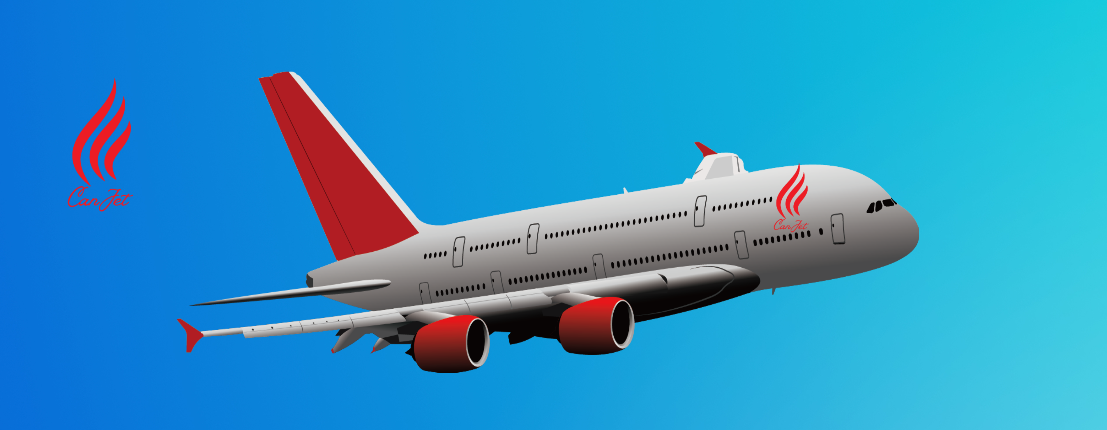
<img class="banner" src="./images/banner.jpg" alt="canjet plane">
Left Aligned (Default)
This is a regular image aligned to the left side of the browser. This image does not require any positioning since they are aligned to the left side by default.

<img src="https://images.unsplash.com/photo-1540962351504-03099e0a754b?ixlib=rb-1.2.1&ixid=MnwxMjA3fDB8MHxwaG90by1wYWdlfHx8fGVufDB8fHx8&auto=format&fit=crop&w=1374&q=80"alt="Jet image">
Right Aligned
This is an image aligned to the right side of the browser using display: flex;. It is important to wrap the image inside its own <div> tag and apply the flex to the div itself.

        <div class="flexDivRight">
            <img src="https://images.unsplash.com/photo-1625513123245-fcb02d69ad12?ixlib=rb-1.2.1&ixid=MnwxMjA3fDB8MHxwaG90by1wYWdlfHx8fGVufDB8fHx8&auto=format&fit=crop&w=1548&q=80" alt="Leather interior image">
        </div>
Center Aligned
This is an image aligned to the center of the browser using display: flex;. Same principle applies to this, as in the example above.

        <div class="flexDivCenter">
            <img src="https://images.unsplash.com/photo-1566212775038-532d06eda485?ixlib=rb-1.2.1&ixid=MnwxMjA3fDB8MHxwaG90by1wYWdlfHx8fGVufDB8fHx8&auto=format&fit=crop&w=1476&q=80" alt="Sunset Jet image">
        </div>